D. W. Cruickshank ~ 2016 ~
Comedias sueltas were almost always printed in quarto, and usually in the simplest form of that format, quarto in fours: a single sheet folded twice to make four leaves (hence “quarto”), i.e., eight pages. The standard Spanish sheet was about 44cm by 31cm, so an untrimmed quarto leaf is about 22cm by 15.5cm. Experiment with a piece of paper folded twice shows that the side containing page 1 also has 4, 5 and 8: this is the “outer forme”, because it is on the outside of the first fold. The other (“inner”) forme has pages 2, 3, 6 and 7. As printers were often short of type, they did not set pages seriatim, but by formes. To produce the inner forme, a compositor had to “cast off” (count the words or lines) pages 1, 4 and 5; to produce the outer, pages 2, 3, 6 and 7. Beginning with the inner forme saved one page of casting off, so this was the normal method. Lines of verse were easier to cast off than continuous prose, but casting-off was easily bungled: too little material was padded out with extra spaces, while too much was compressed by using contractions (“grãde” for “grande”, etc.), or even by cutting text.
Every compositor has his own style: different abbreviations for speakers’ names, different type designs for setting lines in the heading, different ways of spacing and setting the author’s name, the title and the reparto, etc.
A compositor setting an edition from an earlier one could avoid casting off entirely by following his copy page for page. To do so successfully he had to use type similar to his original’s. As most suelta texts were set in pica (12-point), the commonest type-size, this was not hard. A piece of type is three-dimensional, but the only dimensions we can measure on a printed page are the vertical (“body-size”) and horizontal (“set”). Body-size is best measured in units of twenty lines: you choose a point on line 1 and measure the distance to a corresponding point on line 21; even pica could vary between 80mm and 89mm per 20 lines. Horizontal measurement of the same word in different fonts often produces different results: finding appropriate words in a reprint is obviously easy.
Unfortunately, these simple tests suppose that we are working from originals or original-size prints; but even simpler tests are possible. We can lay a ruler diagonally across a page of one suelta, running from the first letter in line 1 to the last letter in the final line, and noting which letters it cuts through in the middle. If the second suelta is a separate edition, the ruler will almost certainly cut through different letters. (This can even be done on the screen, with no print-out at all.) Those with no ruler (!) can compare the position of a letter in one line in relation to letters in lines above and below, or the position of a catchword or signature-letter in relation to the line above: reprints will show differences.
Extensive study (of, say, Type Specimen Facsimiles) can enable us to identify fonts and their original designers, but close observation enables us to see differences without this information. Good letters and symbols to look at are E, M, Q, R, T, ç, g, ?, and !. Compare:
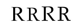
(Times, Garamond, Palatino, Sylfaen)
Italics offer even better possibilities. Compare:
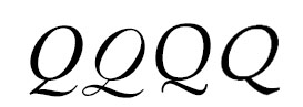
(Times, Garamond, Palatino, Sylfaen)
These are modern, but old designs varied as much. Plays need numerous italic capitals for speakers’ names, and lots of ! and ?: some printers often had to use roman capitals, or borrow different designs from other fonts. The press squeezed grit in the ink into the type, and the resulting damage is often obvious, especially in larger sizes.
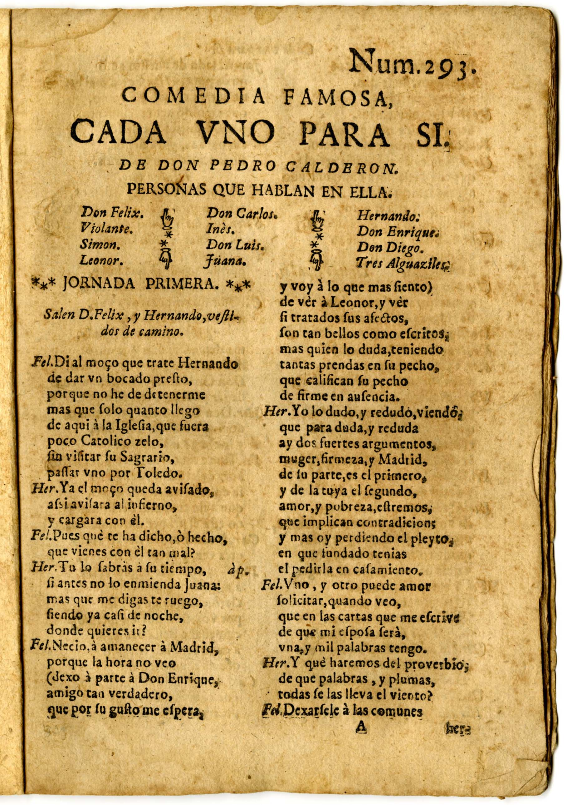
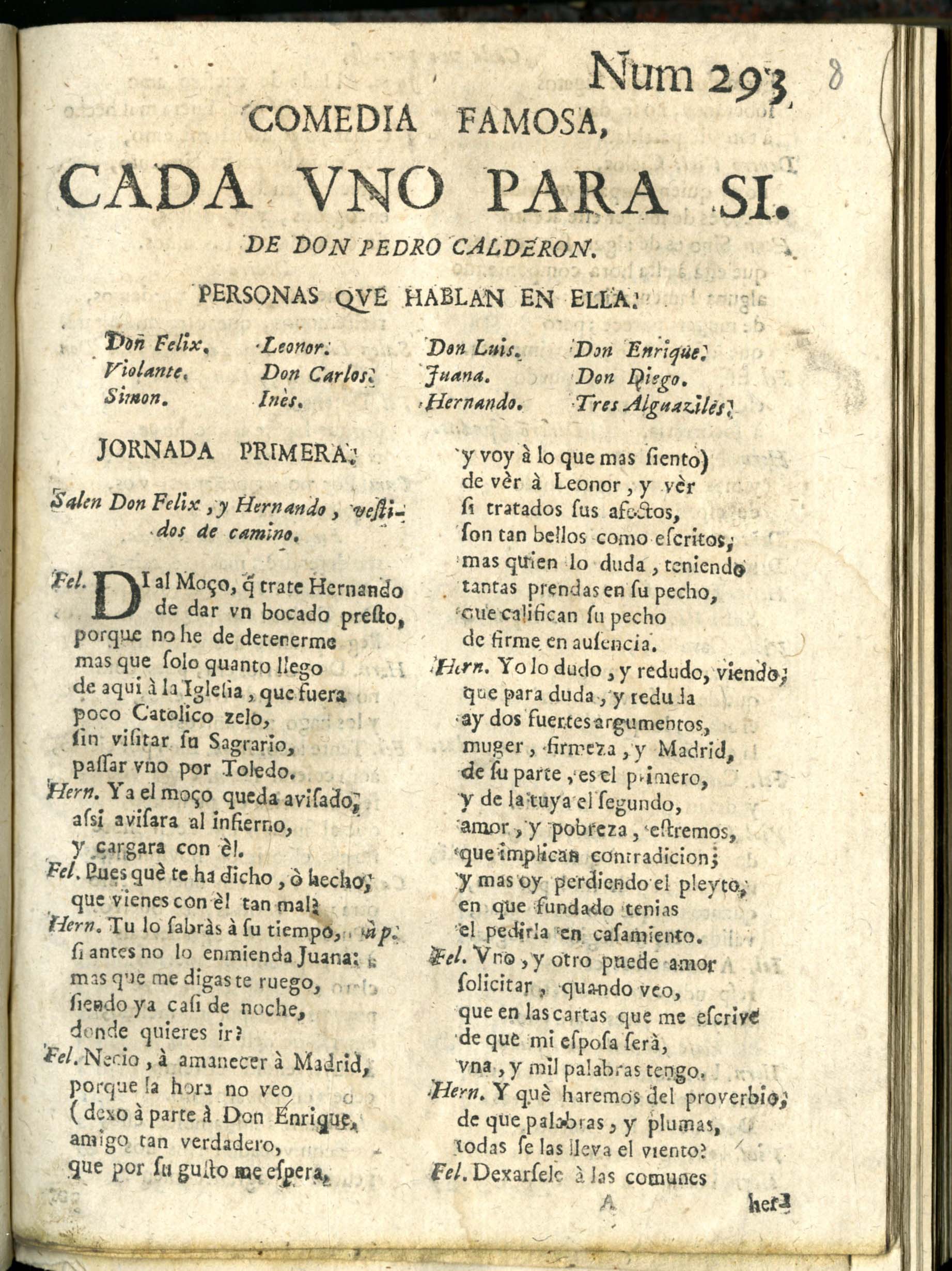
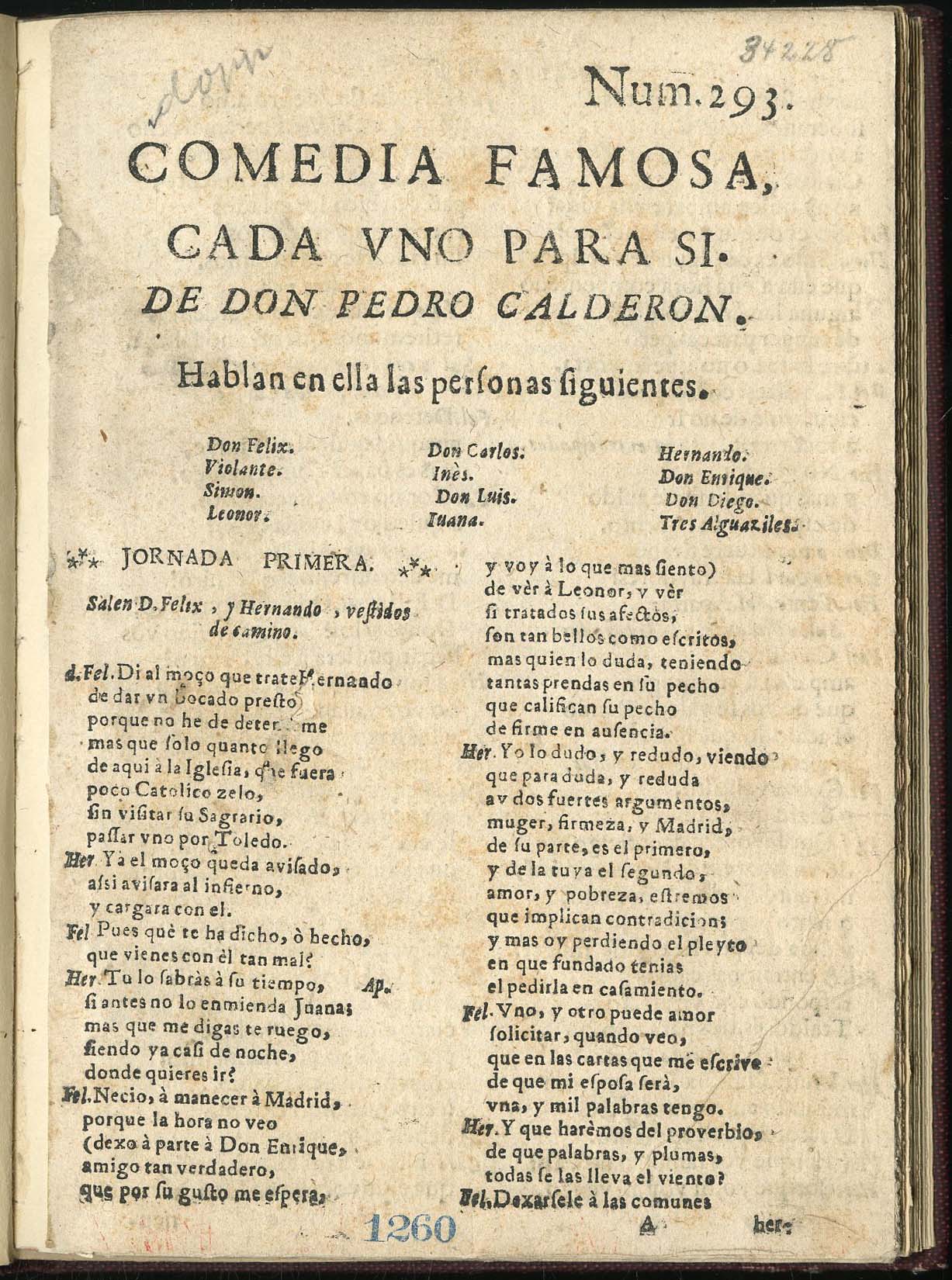
Finally, every compositor has his own style: different abbreviations for speakers’ names, different type designs for setting lines in the heading, different ways of spacing and setting the author’s name, the title and the reparto, etc. We have supplied images of the first pages of four sueltas of Calderón’s Cada uno para sí. All have the same series number, 293, and all are probably Madrid, circa 1690–1700. You have to look carefully, but not painstakingly closely, to notice the typographical differences in these four editions.